


Live Preview (Coming Soon)

Eco-Addis Mobile — Super App for Addis Ababa
Title
Eco-Addis — A super-app for e-commerce, food delivery and ride-hailing in Addis Ababa
My Role
Lead UX/UI Designer
Team
1 Product Manager, 1 UI Designer, 1 UX Researcher, 2 Developers
Timeline
5 Months
Project Type
Personal / Client
Tools Used
Figma, FigJam, Google Forms, Maze

Problem Statement
Addis Ababa's rapidly growing urban population faces fragmented digital commerce experiences — separate apps for shopping, food delivery, and transportation. Vendors lack affordable digital storefronts, while consumers juggle multiple platforms with inconsistent UX. Eco-Addis was designed to solve this with a single, unified super-app ecosystem tailored specifically to Addis Ababa's urban lifestyle — supporting Ethiopian Birr (ETB), Amharic context, and local business categories.

Users & Pain Points
Who are the users?
Urban Addis Ababa residents aged 18–40 — students, professionals, and small business owners who are mobile-first consumers.
What are their goals?
Shop for products, food, and services in one place|Find nearby restaurants and get food delivered quickly|Order affordable rides without switching apps|Sell products or run a vendor shop digitally|Discover local businesses through video and stories
Pain points
•
No single app serving e-commerce, food delivery, and rides in the Ethiopian market|Existing global apps (Jumia, Uber) lack local language support and local business inventory|Small vendors have no accessible digital storefront|Currency and payment flows are not localized (no ETB, no local delivery logic)|Distrust of complicated onboarding — users drop off before first purchase
•
Disputes over draw fairness — no verifiable random selection
•
No single place to view contribution history, remaining rounds, or upcoming draws
•
Organizers overwhelmed managing payments and member communications manually
•
No formal way to submit a cancellation or special request
No single app serving e-commerce, food delivery, and rides in the Ethiopian market|Existing global apps (Jumia, Uber) lack local language support and local business inventory|Small vendors have no accessible digital storefront|Currency and payment flows are not localized (no ETB, no local delivery logic)|Distrust of complicated onboarding — users drop off before first purchase
"I want to see my payment history and the draw results in one place — not scroll through a WhatsApp group."

Process & Methods
Goals
Understand how Addis Ababa residents currently shop, eat, and travel — and where digital tools fail them
Methods
•
User interviews with Addis residents across income groups|Competitor analysis: Jumia Ethiopia, ride apps, informal WhatsApp commerce|Card sorting to determine navigation structure for a multi-service app|Contextual inquiry at local markets and food spots (Bole, Saris, Merkato)
Key Findings & Insights
Users strongly prefer a single app over switching — super-app model validated|ETB pricing and Amharic map labels are trust signals, not just nice-to-haves|Flash deals and time-limited offers drive impulse purchases in food delivery|Vendors want easy onboarding — category/subcategory industry selection must be simple|Social features (stories, video Watch tab) increase time-in-app and discovery|Ride-hailing users want saved frequent destinations and trip history at a glance

Final Solution
→
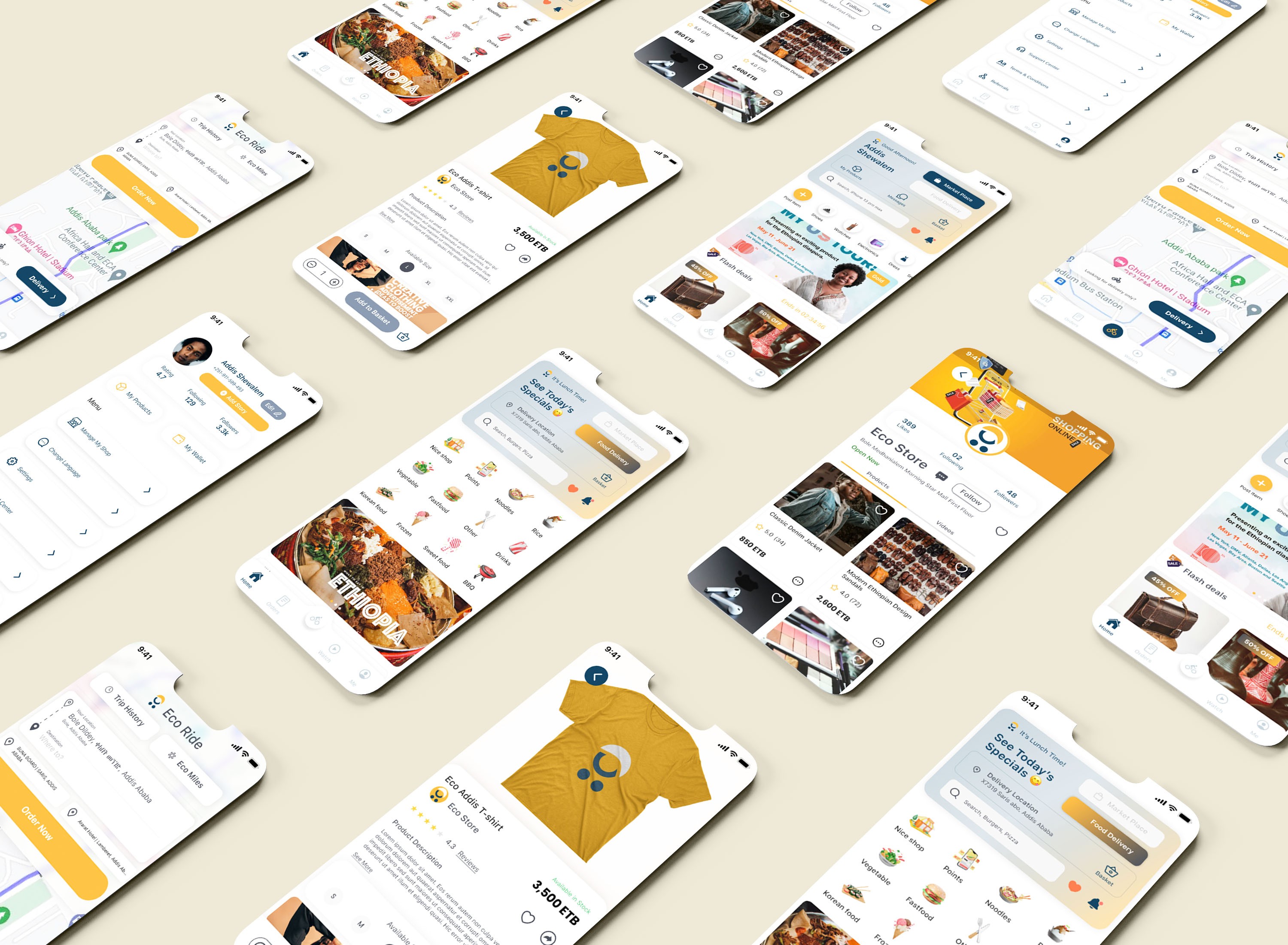
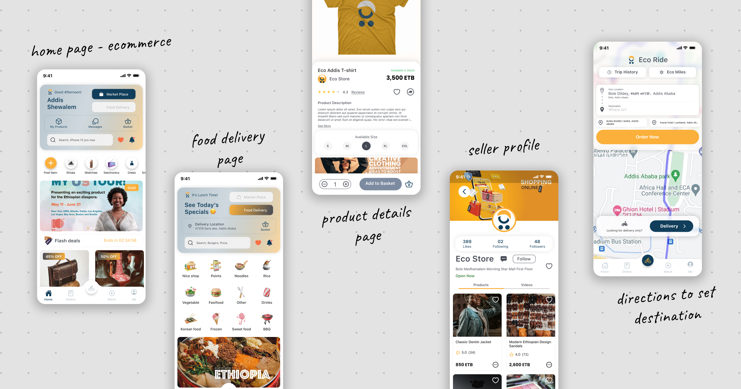
A clean locally-rooted mobile super-app with five core verticals: Market Place (product discovery, vendor shops, wishlist, reviews, flash deals); Food Delivery (restaurant pages, special offers, basket, checkout, order tracking); Eco Ride (map-based ride ordering, delivery mode, trip history, Eco Miles loyalty); Watch (vertical video feed for business promotion and discovery); and Me (user profile, my products, wallet, shop management, referrals). Design uses amber/golden yellow primary, dark navy secondary, ETB currency throughout, and real Addis Ababa addresses and Amharic map context.

Impact / Results
•
Onboarding completion rate target: >80%|Time to first order target: <3 minutes|Task success rate (find and add item to cart) target: >90%|Vendor registration completion target: >70%|SUS Score target: >80

Lessons Learned
Designing a super-app requires ruthless information architecture — the hardest challenge was keeping five product verticals discoverable without overwhelming the home screen|Localization is a UX feature not an afterthought — real Addis Ababa streets, ETB pricing, and Ethiopian food context in banners built immediate trust|Social commerce is underutilized in African markets — the Watch tab and Stories features were strong discovery and retention mechanisms|Vendors are users too — the vendor registration and boost flows needed as much design care as the consumer-facing shopping experience
© 2026 Nahom Girma. Designed & Hosted with 🦾 on


Live Preview (Coming Soon)
Eco-Addis Mobile — Super App for Addis Ababa
Title
Eco-Addis — A super-app for e-commerce, food delivery and ride-hailing in Addis Ababa
My Role
Lead UX/UI Designer
Team
1 Product Manager, 1 UI Designer, 1 UX Researcher, 2 Developers
Timeline
5 Months
Project Type
Personal / Client
Tools Used
Figma, FigJam, Google Forms, Maze
Problem Statement
Addis Ababa's rapidly growing urban population faces fragmented digital commerce experiences — separate apps for shopping, food delivery, and transportation. Vendors lack affordable digital storefronts, while consumers juggle multiple platforms with inconsistent UX. Eco-Addis was designed to solve this with a single, unified super-app ecosystem tailored specifically to Addis Ababa's urban lifestyle — supporting Ethiopian Birr (ETB), Amharic context, and local business categories.
Users & Pain Points
Who are the users?
Urban Addis Ababa residents aged 18–40 — students, professionals, and small business owners who are mobile-first consumers.
What are their goals?
Shop for products, food, and services in one place|Find nearby restaurants and get food delivered quickly|Order affordable rides without switching apps|Sell products or run a vendor shop digitally|Discover local businesses through video and stories
Pain points
•
No single app serving e-commerce, food delivery, and rides in the Ethiopian market|Existing global apps (Jumia, Uber) lack local language support and local business inventory|Small vendors have no accessible digital storefront|Currency and payment flows are not localized (no ETB, no local delivery logic)|Distrust of complicated onboarding — users drop off before first purchase
•
Disputes over draw fairness — no verifiable random selection
•
No single place to view contribution history, remaining rounds, or upcoming draws
•
Organizers overwhelmed managing payments and member communications manually
•
No formal way to submit a cancellation or special request
No single app serving e-commerce, food delivery, and rides in the Ethiopian market|Existing global apps (Jumia, Uber) lack local language support and local business inventory|Small vendors have no accessible digital storefront|Currency and payment flows are not localized (no ETB, no local delivery logic)|Distrust of complicated onboarding — users drop off before first purchase
"I want to see my payment history and the draw results in one place — not scroll through a WhatsApp group."
Process & Methods
Goals
Understand how Addis Ababa residents currently shop, eat, and travel — and where digital tools fail them
Methods
•
User interviews with Addis residents across income groups|Competitor analysis: Jumia Ethiopia, ride apps, informal WhatsApp commerce|Card sorting to determine navigation structure for a multi-service app|Contextual inquiry at local markets and food spots (Bole, Saris, Merkato)
Key Findings & Insights
Users strongly prefer a single app over switching — super-app model validated|ETB pricing and Amharic map labels are trust signals, not just nice-to-haves|Flash deals and time-limited offers drive impulse purchases in food delivery|Vendors want easy onboarding — category/subcategory industry selection must be simple|Social features (stories, video Watch tab) increase time-in-app and discovery|Ride-hailing users want saved frequent destinations and trip history at a glance
Final Solution
→
A clean locally-rooted mobile super-app with five core verticals: Market Place (product discovery, vendor shops, wishlist, reviews, flash deals); Food Delivery (restaurant pages, special offers, basket, checkout, order tracking); Eco Ride (map-based ride ordering, delivery mode, trip history, Eco Miles loyalty); Watch (vertical video feed for business promotion and discovery); and Me (user profile, my products, wallet, shop management, referrals). Design uses amber/golden yellow primary, dark navy secondary, ETB currency throughout, and real Addis Ababa addresses and Amharic map context.
Impact / Results
•
Onboarding completion rate target: >80%|Time to first order target: <3 minutes|Task success rate (find and add item to cart) target: >90%|Vendor registration completion target: >70%|SUS Score target: >80
Lessons Learned
Designing a super-app requires ruthless information architecture — the hardest challenge was keeping five product verticals discoverable without overwhelming the home screen|Localization is a UX feature not an afterthought — real Addis Ababa streets, ETB pricing, and Ethiopian food context in banners built immediate trust|Social commerce is underutilized in African markets — the Watch tab and Stories features were strong discovery and retention mechanisms|Vendors are users too — the vendor registration and boost flows needed as much design care as the consumer-facing shopping experience
© 2026 Nahom Girma. Designed & Hosted with 🦾 on
Live Preview (Coming Soon)
Read21 — Teacher Certification Platform
Title
Read21 — A Teacher Certification Platform for the Science of Reading
My Role
Lead UX/UI Designer
Team
1 Product Manager, 1 Developer, 1 UX/UI Designer
Timeline
1 Month
Project Type
Client
Tools Used
Figma
Problem Statement
The Science of Reading is a proven, research-backed methodology for teaching children to read — covering phonemic awareness, phonics, fluency, vocabulary, and comprehension. But most teachers have never been formally trained in it. Traditional in-person workshops are expensive, infrequent, and hard to scale. Read21 needed an online platform that could certify teachers in this methodology — offering a structured, self-paced learning experience that felt credible and professional, not like just another eLearning site. The core promise: learn to teach students to read in as little as 21 days, using only 30 minutes a day.
Users & Pain Points
Who are the users?
Elementary school teachers (K–3) and literacy coaches in the US, looking to improve their reading instruction skills. Often purchasing individually or through school district group plans.
What are their goals?
Get certified in the Science of Reading|Implement evidence-based techniques in their classroom|Have tangible proof of professional development|School districts need a scalable solution for training multiple teachers at once
Pain points
•
No accessible, affordable way to get trained in Science of Reading outside of expensive conferences|Generic eLearning platforms don't feel credible enough for professional certification|No way to practice teaching techniques before entering a real classroom|School districts need a scalable solution for training multiple teachers at once
•
Disputes over draw fairness — no verifiable random selection
•
No single place to view contribution history, remaining rounds, or upcoming draws
•
Organizers overwhelmed managing payments and member communications manually
•
No formal way to submit a cancellation or special request
No accessible, affordable way to get trained in Science of Reading outside of expensive conferences|Generic eLearning platforms don't feel credible enough for professional certification|No way to practice teaching techniques before entering a real classroom|School districts need a scalable solution for training multiple teachers at once
"I want to see my payment history and the draw results in one place — not scroll through a WhatsApp group."
Process & Methods
Goals
Understand how teachers currently upskill, what makes them trust and complete online certification courses, and where current eLearning tools fall short
Methods
•
Stakeholder interviews with the Read21 organization|Analysis of the existing Read21 curriculum and methodology|Competitive analysis of eLearning platforms (Coursera, Teachable, Canvas)|Review of teacher professional development workflows
Key Findings & Insights
Teachers need to feel the course is official and credible — design signals trust as much as content does|The Science of Reading has 5 clear pillars (Phonics, Phonemic Awareness, Fluency, Vocabulary, Comprehension) — these became the visual and structural backbone of the product|A virtual classroom demo feature was a major differentiator that needed to be surfaced prominently|School districts are a key buying channel so the registration flow needed a School District field and group discount support
Final Solution
→
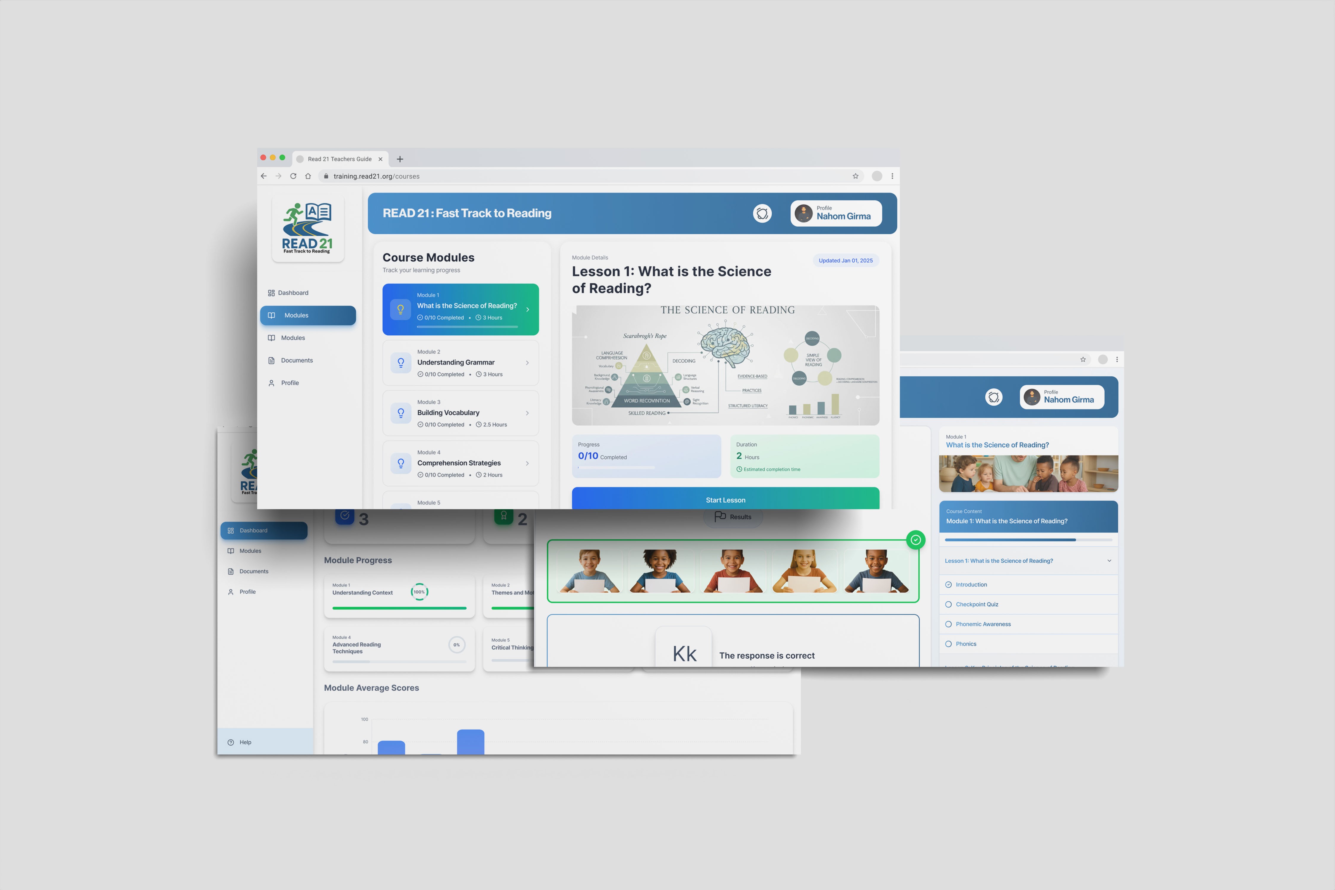
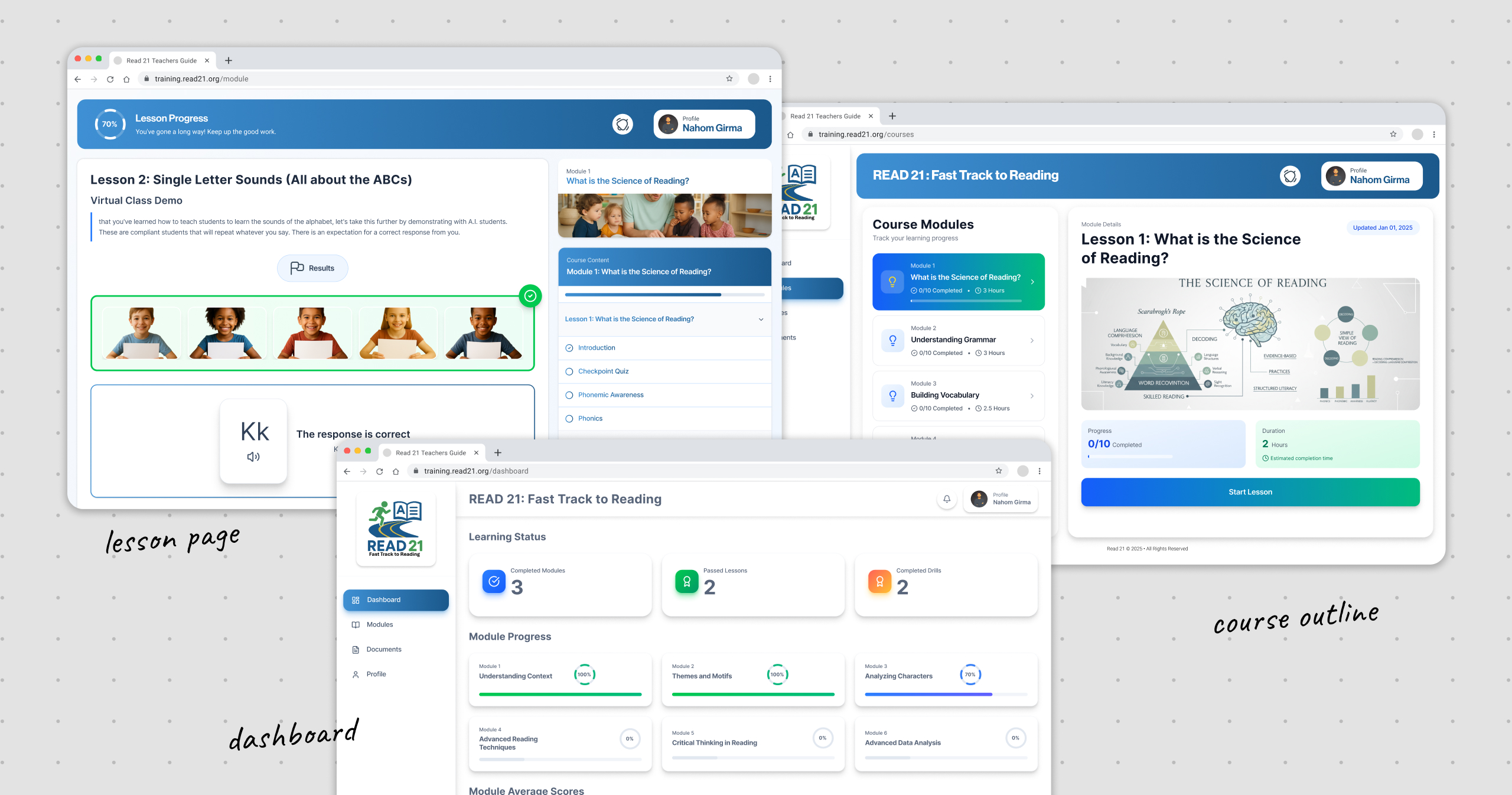
A full-featured web certification platform at training.read21.org with: marketing and discovery pages; 3-step enrollment with school district support and card payment; learning dashboard with progress overview and module scores chart; module library organized by the 5 Science of Reading pillars; interactive lesson player with Virtual Class Demo (AI students); and supporting pages (documents library, user profile, help).
Impact / Results
•
Enrollment completion rate (from landing page to payment confirmation) — to be filled|% of enrolled teachers who complete all modules — to be filled|Average lesson session duration — to be filled|Teacher satisfaction/NPS score post-certification — to be filled
Lessons Learned
Credibility is a design deliverable — every visual decision either reinforces or undermines perceived legitimacy for a $550 certification product|The road map metaphor (5 Science of Reading pillars as road signs) communicated curriculum structure before a user even registered|Designing for institutional buyers changes your information architecture — registration, user management, and pricing display all shift|Interactive learning needs more orientation than passive content — users need a clear mental model before engaging with the Virtual Class Demo
© 2026 Nahom Girma. Designed & Hosted with 🦾 on