


Live Preview (Coming Soon)

Eco-Addis Mobile — Super App for Addis Ababa
Title
Eco-Addis — A super-app for e-commerce, food delivery and ride-hailing in Addis Ababa
My Role
Lead UX/UI Designer
Team
1 Product Manager, 1 UI Designer, 1 UX Researcher, 2 Developers
Timeline
5 Months
Project Type
Personal / Client
Tools Used
Figma, FigJam, Google Forms, Maze

Problem Statement
Addis Ababa's rapidly growing urban population faces fragmented digital commerce experiences — separate apps for shopping, food delivery, and transportation. Vendors lack affordable digital storefronts, while consumers juggle multiple platforms with inconsistent UX. Eco-Addis was designed to solve this with a single, unified super-app ecosystem tailored specifically to Addis Ababa's urban lifestyle — supporting Ethiopian Birr (ETB), Amharic context, and local business categories.

Users & Pain Points
Who are the users?
Urban Addis Ababa residents aged 18–40 — students, professionals, and small business owners who are mobile-first consumers.
What are their goals?
Shop for products, food, and services in one place|Find nearby restaurants and get food delivered quickly|Order affordable rides without switching apps|Sell products or run a vendor shop digitally|Discover local businesses through video and stories
Pain points
•
No single app serving e-commerce, food delivery, and rides in the Ethiopian market|Existing global apps (Jumia, Uber) lack local language support and local business inventory|Small vendors have no accessible digital storefront|Currency and payment flows are not localized (no ETB, no local delivery logic)|Distrust of complicated onboarding — users drop off before first purchase
•
Disputes over draw fairness — no verifiable random selection
•
No single place to view contribution history, remaining rounds, or upcoming draws
•
Organizers overwhelmed managing payments and member communications manually
•
No formal way to submit a cancellation or special request
No single app serving e-commerce, food delivery, and rides in the Ethiopian market|Existing global apps (Jumia, Uber) lack local language support and local business inventory|Small vendors have no accessible digital storefront|Currency and payment flows are not localized (no ETB, no local delivery logic)|Distrust of complicated onboarding — users drop off before first purchase
"I want to see my payment history and the draw results in one place — not scroll through a WhatsApp group."

Process & Methods
Goals
Understand how Addis Ababa residents currently shop, eat, and travel — and where digital tools fail them
Methods
•
User interviews with Addis residents across income groups|Competitor analysis: Jumia Ethiopia, ride apps, informal WhatsApp commerce|Card sorting to determine navigation structure for a multi-service app|Contextual inquiry at local markets and food spots (Bole, Saris, Merkato)
Key Findings & Insights
Users strongly prefer a single app over switching — super-app model validated|ETB pricing and Amharic map labels are trust signals, not just nice-to-haves|Flash deals and time-limited offers drive impulse purchases in food delivery|Vendors want easy onboarding — category/subcategory industry selection must be simple|Social features (stories, video Watch tab) increase time-in-app and discovery|Ride-hailing users want saved frequent destinations and trip history at a glance

Final Solution
→
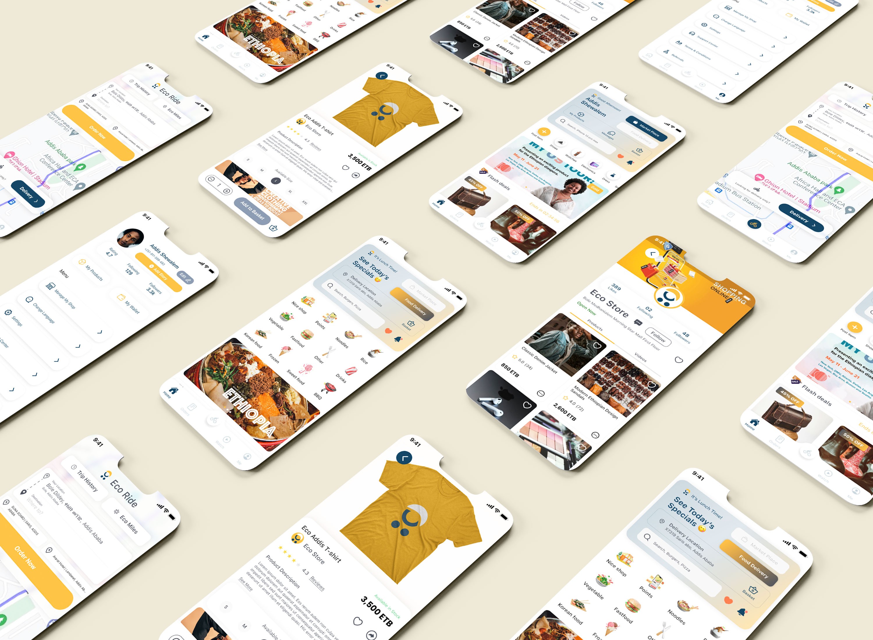
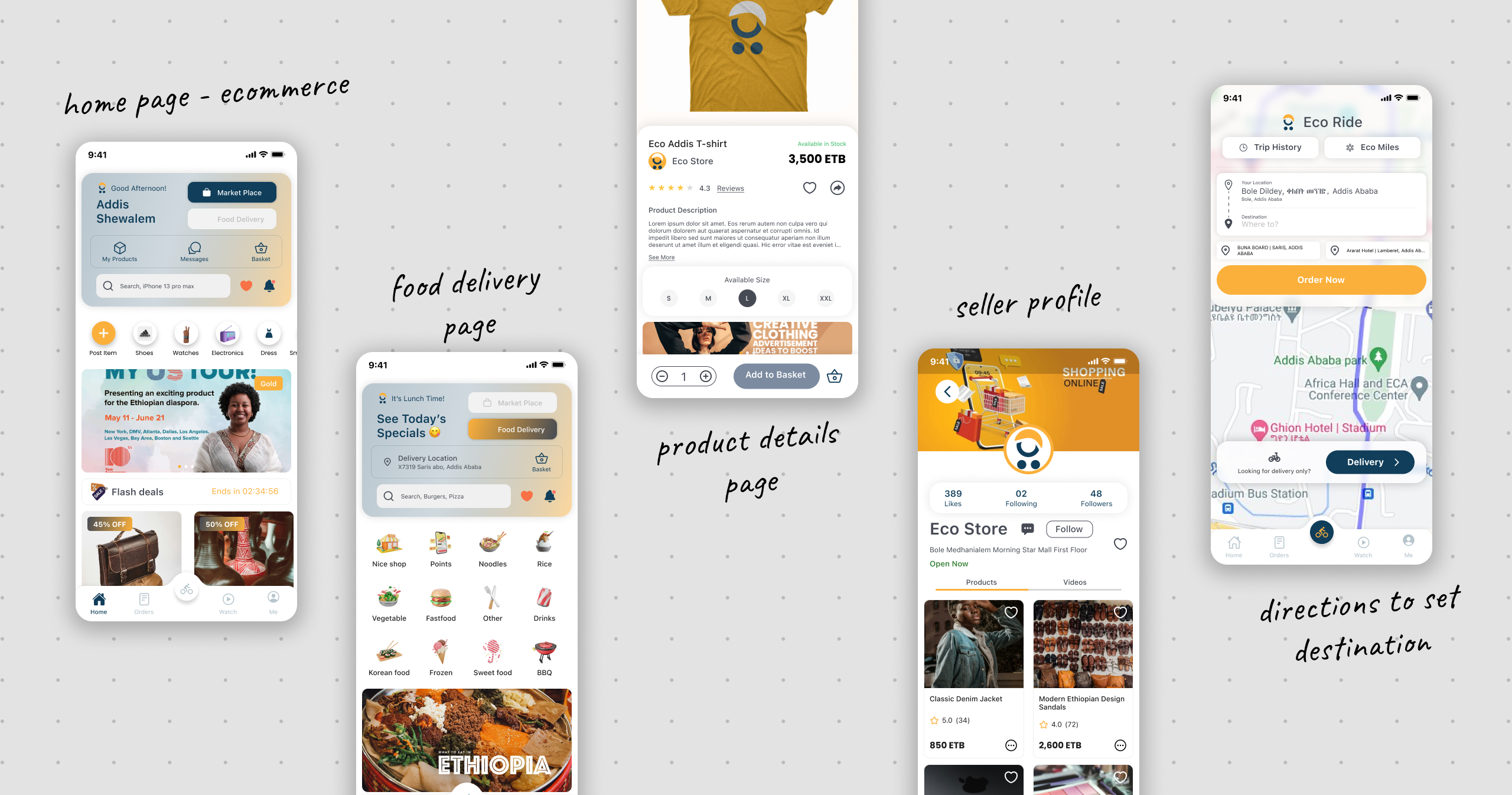
A clean locally-rooted mobile super-app with five core verticals: Market Place (product discovery, vendor shops, wishlist, reviews, flash deals); Food Delivery (restaurant pages, special offers, basket, checkout, order tracking); Eco Ride (map-based ride ordering, delivery mode, trip history, Eco Miles loyalty); Watch (vertical video feed for business promotion and discovery); and Me (user profile, my products, wallet, shop management, referrals). Design uses amber/golden yellow primary, dark navy secondary, ETB currency throughout, and real Addis Ababa addresses and Amharic map context.

Impact / Results
•
Onboarding completion rate target: >80%|Time to first order target: <3 minutes|Task success rate (find and add item to cart) target: >90%|Vendor registration completion target: >70%|SUS Score target: >80

Lessons Learned
Designing a super-app requires ruthless information architecture — the hardest challenge was keeping five product verticals discoverable without overwhelming the home screen|Localization is a UX feature not an afterthought — real Addis Ababa streets, ETB pricing, and Ethiopian food context in banners built immediate trust|Social commerce is underutilized in African markets — the Watch tab and Stories features were strong discovery and retention mechanisms|Vendors are users too — the vendor registration and boost flows needed as much design care as the consumer-facing shopping experience
© 2026 Nahom Girma. Designed & Hosted with 🦾 on


Live Preview (Coming Soon)
Eco-Addis Mobile — Super App for Addis Ababa
Title
Eco-Addis — A super-app for e-commerce, food delivery and ride-hailing in Addis Ababa
My Role
Lead UX/UI Designer
Team
1 Product Manager, 1 UI Designer, 1 UX Researcher, 2 Developers
Timeline
5 Months
Project Type
Personal / Client
Tools Used
Figma, FigJam, Google Forms, Maze
Problem Statement
Addis Ababa's rapidly growing urban population faces fragmented digital commerce experiences — separate apps for shopping, food delivery, and transportation. Vendors lack affordable digital storefronts, while consumers juggle multiple platforms with inconsistent UX. Eco-Addis was designed to solve this with a single, unified super-app ecosystem tailored specifically to Addis Ababa's urban lifestyle — supporting Ethiopian Birr (ETB), Amharic context, and local business categories.
Users & Pain Points
Who are the users?
Urban Addis Ababa residents aged 18–40 — students, professionals, and small business owners who are mobile-first consumers.
What are their goals?
Shop for products, food, and services in one place|Find nearby restaurants and get food delivered quickly|Order affordable rides without switching apps|Sell products or run a vendor shop digitally|Discover local businesses through video and stories
Pain points
•
No single app serving e-commerce, food delivery, and rides in the Ethiopian market|Existing global apps (Jumia, Uber) lack local language support and local business inventory|Small vendors have no accessible digital storefront|Currency and payment flows are not localized (no ETB, no local delivery logic)|Distrust of complicated onboarding — users drop off before first purchase
•
Disputes over draw fairness — no verifiable random selection
•
No single place to view contribution history, remaining rounds, or upcoming draws
•
Organizers overwhelmed managing payments and member communications manually
•
No formal way to submit a cancellation or special request
No single app serving e-commerce, food delivery, and rides in the Ethiopian market|Existing global apps (Jumia, Uber) lack local language support and local business inventory|Small vendors have no accessible digital storefront|Currency and payment flows are not localized (no ETB, no local delivery logic)|Distrust of complicated onboarding — users drop off before first purchase
"I want to see my payment history and the draw results in one place — not scroll through a WhatsApp group."
Process & Methods
Goals
Understand how Addis Ababa residents currently shop, eat, and travel — and where digital tools fail them
Methods
•
User interviews with Addis residents across income groups|Competitor analysis: Jumia Ethiopia, ride apps, informal WhatsApp commerce|Card sorting to determine navigation structure for a multi-service app|Contextual inquiry at local markets and food spots (Bole, Saris, Merkato)
Key Findings & Insights
Users strongly prefer a single app over switching — super-app model validated|ETB pricing and Amharic map labels are trust signals, not just nice-to-haves|Flash deals and time-limited offers drive impulse purchases in food delivery|Vendors want easy onboarding — category/subcategory industry selection must be simple|Social features (stories, video Watch tab) increase time-in-app and discovery|Ride-hailing users want saved frequent destinations and trip history at a glance
Final Solution
→
A clean locally-rooted mobile super-app with five core verticals: Market Place (product discovery, vendor shops, wishlist, reviews, flash deals); Food Delivery (restaurant pages, special offers, basket, checkout, order tracking); Eco Ride (map-based ride ordering, delivery mode, trip history, Eco Miles loyalty); Watch (vertical video feed for business promotion and discovery); and Me (user profile, my products, wallet, shop management, referrals). Design uses amber/golden yellow primary, dark navy secondary, ETB currency throughout, and real Addis Ababa addresses and Amharic map context.
Impact / Results
•
Onboarding completion rate target: >80%|Time to first order target: <3 minutes|Task success rate (find and add item to cart) target: >90%|Vendor registration completion target: >70%|SUS Score target: >80
Lessons Learned
Designing a super-app requires ruthless information architecture — the hardest challenge was keeping five product verticals discoverable without overwhelming the home screen|Localization is a UX feature not an afterthought — real Addis Ababa streets, ETB pricing, and Ethiopian food context in banners built immediate trust|Social commerce is underutilized in African markets — the Watch tab and Stories features were strong discovery and retention mechanisms|Vendors are users too — the vendor registration and boost flows needed as much design care as the consumer-facing shopping experience
© 2026 Nahom Girma. Designed & Hosted with 🦾 on
Live Preview (Coming Soon)
LayoverLife AI — Smart Layover Companion
Title
LayoverLife AI — Your Smart, Friendly Layover Companion
My Role
Lead UX/UI Designer
Team
1 Product Manager, 1 Developer, 1 UX/UI Designer
Timeline
2 Weeks
Project Type
Personal / Startup
Tools Used
Figma
Problem Statement
Layovers are dead time — but they don't have to be. Whether it's a 45-minute sprint or a 6-hour wait, travelers in airports face the same cluster of small, annoying problems: where's the nearest decent coffee? How long is the TSA line? Can I order food before I even get there? The information exists, but it's scattered across airline apps, Google Maps, airport websites, and strangers. LayoverLife AI brings it all into one AI-powered chat interface — a single place where travelers can ask anything about their airport, get smart answers, and act on them instantly (directions, ordering, payments) without ever switching apps.
Users & Pain Points
Who are the users?
Frequent flyers, business travelers, and transit passengers aged 22–45 who spend significant time in airports and are comfortable with AI-assisted tools.
What are their goals?
Make the most of their layover time — find food, navigate efficiently, check security wait times, and stay organized|Use a single conversational interface that handles all layover micro-tasks in one place|Complete tasks (find coffee, order food, get directions) without switching between multiple apps
Pain points
•
Airport wayfinding is terrible — maps are confusing, signage is inconsistent, and Google Maps doesn't work well inside terminals|TSA wait time info is buried on websites that aren't mobile-friendly|Food ordering at airports requires hunting down specific vendor apps or queuing in long lines|There's no single layover assistant — travelers piece together info from multiple fragmented sources|Stress levels are high; the interface needs to feel calm and frictionless, not overwhelming
•
Disputes over draw fairness — no verifiable random selection
•
No single place to view contribution history, remaining rounds, or upcoming draws
•
Organizers overwhelmed managing payments and member communications manually
•
No formal way to submit a cancellation or special request
Airport wayfinding is terrible — maps are confusing, signage is inconsistent, and Google Maps doesn't work well inside terminals|TSA wait time info is buried on websites that aren't mobile-friendly|Food ordering at airports requires hunting down specific vendor apps or queuing in long lines|There's no single layover assistant — travelers piece together info from multiple fragmented sources|Stress levels are high; the interface needs to feel calm and frictionless, not overwhelming
"I want to see my payment history and the draw results in one place — not scroll through a WhatsApp group."
Process & Methods
Goals
Understand how travelers navigate airports, what information they look for most, and what friction points create the most stress during layovers
Methods
•
Research into airport traveler behavior and layover pain points|Competitor analysis of airport companion apps and AI chat tools|Review of existing TSA wait time apps, airport food ordering platforms, and terminal navigation tools
Key Findings & Insights
The biggest need isn't a map or a menu — it's a single conversational interface that handles all layover micro-tasks in one place|Voice input is critical: travelers are often hands-full (luggage, passport, phone) and typing is cumbersome|AI responses need to be actionable not just informational — Get Directions and Order Now as instant next steps|TSA anxiety is a major trigger — surfacing TSA-specific prompts proactively reduces user stress before they even ask|A freemium model with clear Free/Plus/Team tiers makes sense for both individual travelers and corporate travel teams
Final Solution
→
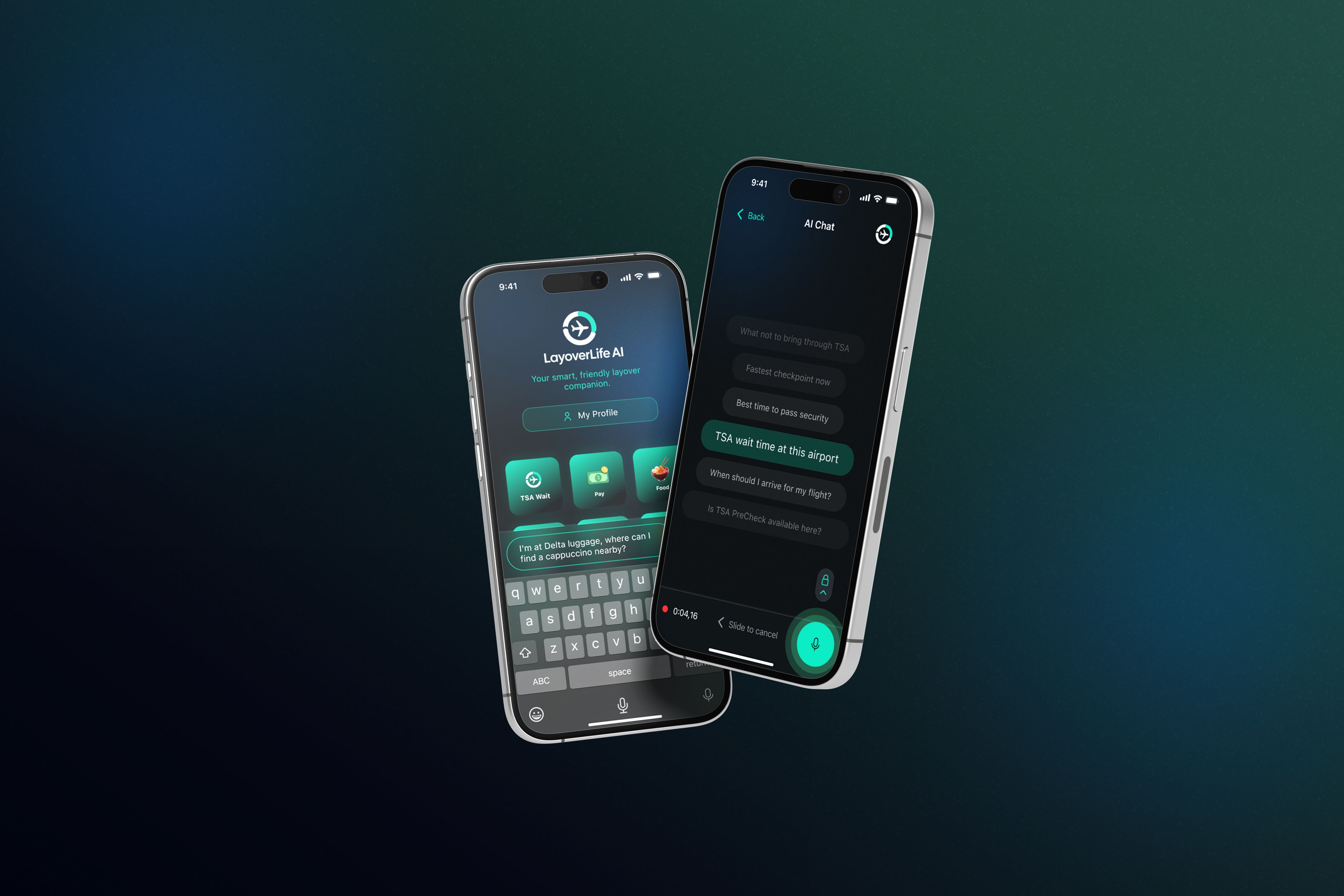
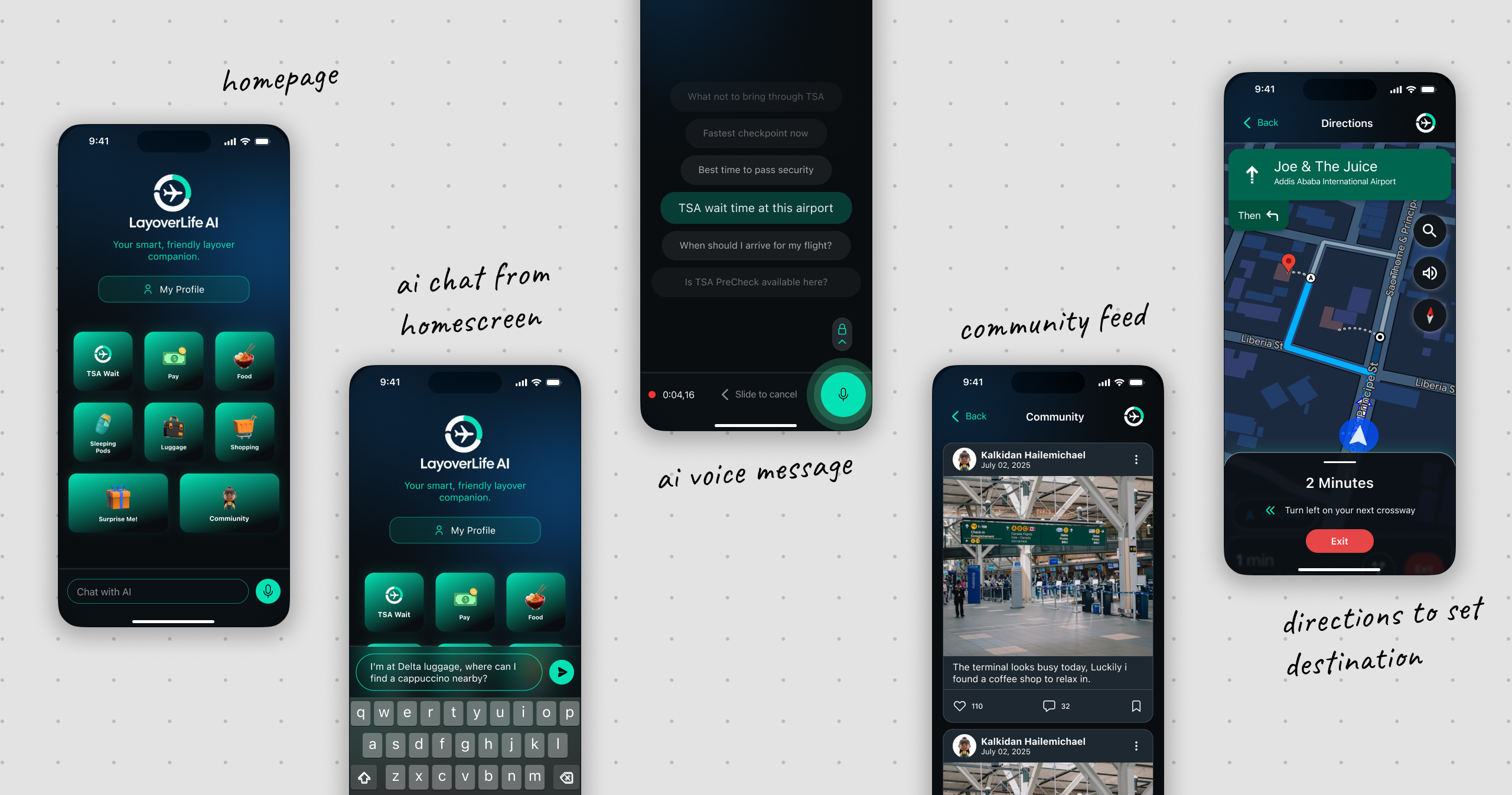
A complete dark-themed AI travel companion iOS app with: conversational AI as the core UX (one input, any layover question answered); contextual action cards embedded in AI replies (directions, ordering, payment one tap away); TSA module with proactive suggested prompts; in-airport navigation with real-time turn-by-turn directions on a dark map UI; food ordering flow with Apple Pay and card payment; voice input for hands-free use; freemium subscription (Free / Plus $20/month / Team $75/person/month); and profile and settings.
Impact / Results
•
% of users who complete a full task (ask to directions or ask to order) in one session — to be filled|Average session length during a layover — to be filled|Voice input adoption rate vs. text typing — to be filled|Free-to-Plus upgrade conversion rate — to be filled|User satisfaction score post-layover — to be filled
Lessons Learned
The answer isn't enough — the action is the product. In a high-stress time-constrained context users don't want to be told where the coffee is; they want to be taken there or have it ordered|Dark mode isn't just aesthetic — it's functional. Airports are bright overwhelming environments and a dark high-contrast UI reduces visual noise|Proactive prompts reduce cognitive load better than empty states — surfacing 6 common TSA questions as selectable chips eliminates the what do I ask anxiety|Voice is a first-class citizen in travel UX — designing voice input as a primary visible interaction mode fundamentally changes how accessible the product feels
© 2026 Nahom Girma. Designed & Hosted with 🦾 on