


Live Preview (Coming Soon)

Eco-Addis Mobile — Super App for Addis Ababa
Title
Eco-Addis — A super-app for e-commerce, food delivery and ride-hailing in Addis Ababa
My Role
Lead UX/UI Designer
Team
1 Product Manager, 1 UI Designer, 1 UX Researcher, 2 Developers
Timeline
5 Months
Project Type
Personal / Client
Tools Used
Figma, FigJam, Google Forms, Maze

Problem Statement
Addis Ababa's rapidly growing urban population faces fragmented digital commerce experiences — separate apps for shopping, food delivery, and transportation. Vendors lack affordable digital storefronts, while consumers juggle multiple platforms with inconsistent UX. Eco-Addis was designed to solve this with a single, unified super-app ecosystem tailored specifically to Addis Ababa's urban lifestyle — supporting Ethiopian Birr (ETB), Amharic context, and local business categories.

Users & Pain Points
Who are the users?
Urban Addis Ababa residents aged 18–40 — students, professionals, and small business owners who are mobile-first consumers.
What are their goals?
Shop for products, food, and services in one place|Find nearby restaurants and get food delivered quickly|Order affordable rides without switching apps|Sell products or run a vendor shop digitally|Discover local businesses through video and stories
Pain points
•
No single app serving e-commerce, food delivery, and rides in the Ethiopian market|Existing global apps (Jumia, Uber) lack local language support and local business inventory|Small vendors have no accessible digital storefront|Currency and payment flows are not localized (no ETB, no local delivery logic)|Distrust of complicated onboarding — users drop off before first purchase
•
Disputes over draw fairness — no verifiable random selection
•
No single place to view contribution history, remaining rounds, or upcoming draws
•
Organizers overwhelmed managing payments and member communications manually
•
No formal way to submit a cancellation or special request
No single app serving e-commerce, food delivery, and rides in the Ethiopian market|Existing global apps (Jumia, Uber) lack local language support and local business inventory|Small vendors have no accessible digital storefront|Currency and payment flows are not localized (no ETB, no local delivery logic)|Distrust of complicated onboarding — users drop off before first purchase
"I want to see my payment history and the draw results in one place — not scroll through a WhatsApp group."

Process & Methods
Goals
Understand how Addis Ababa residents currently shop, eat, and travel — and where digital tools fail them
Methods
•
User interviews with Addis residents across income groups|Competitor analysis: Jumia Ethiopia, ride apps, informal WhatsApp commerce|Card sorting to determine navigation structure for a multi-service app|Contextual inquiry at local markets and food spots (Bole, Saris, Merkato)
Key Findings & Insights
Users strongly prefer a single app over switching — super-app model validated|ETB pricing and Amharic map labels are trust signals, not just nice-to-haves|Flash deals and time-limited offers drive impulse purchases in food delivery|Vendors want easy onboarding — category/subcategory industry selection must be simple|Social features (stories, video Watch tab) increase time-in-app and discovery|Ride-hailing users want saved frequent destinations and trip history at a glance

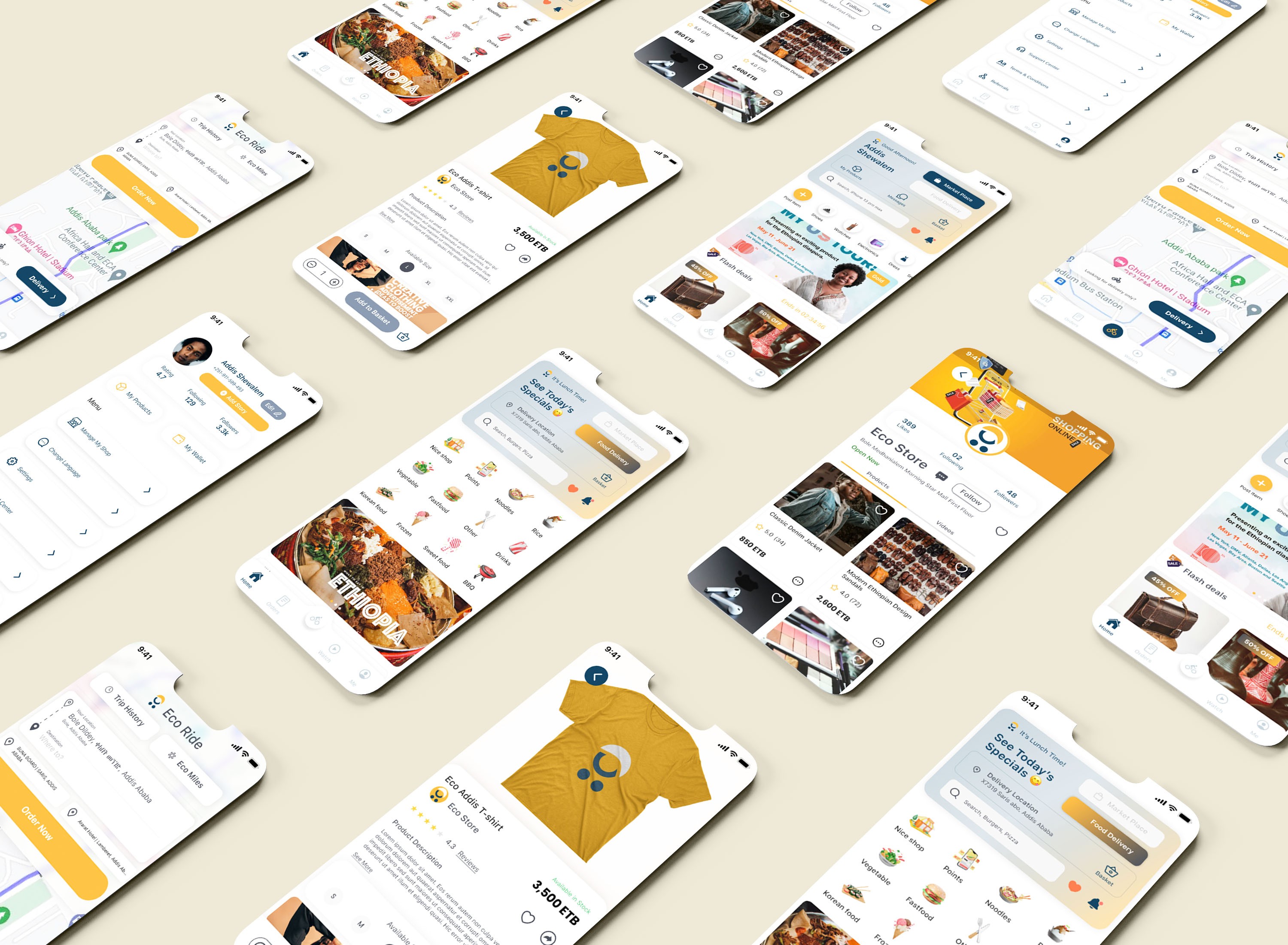
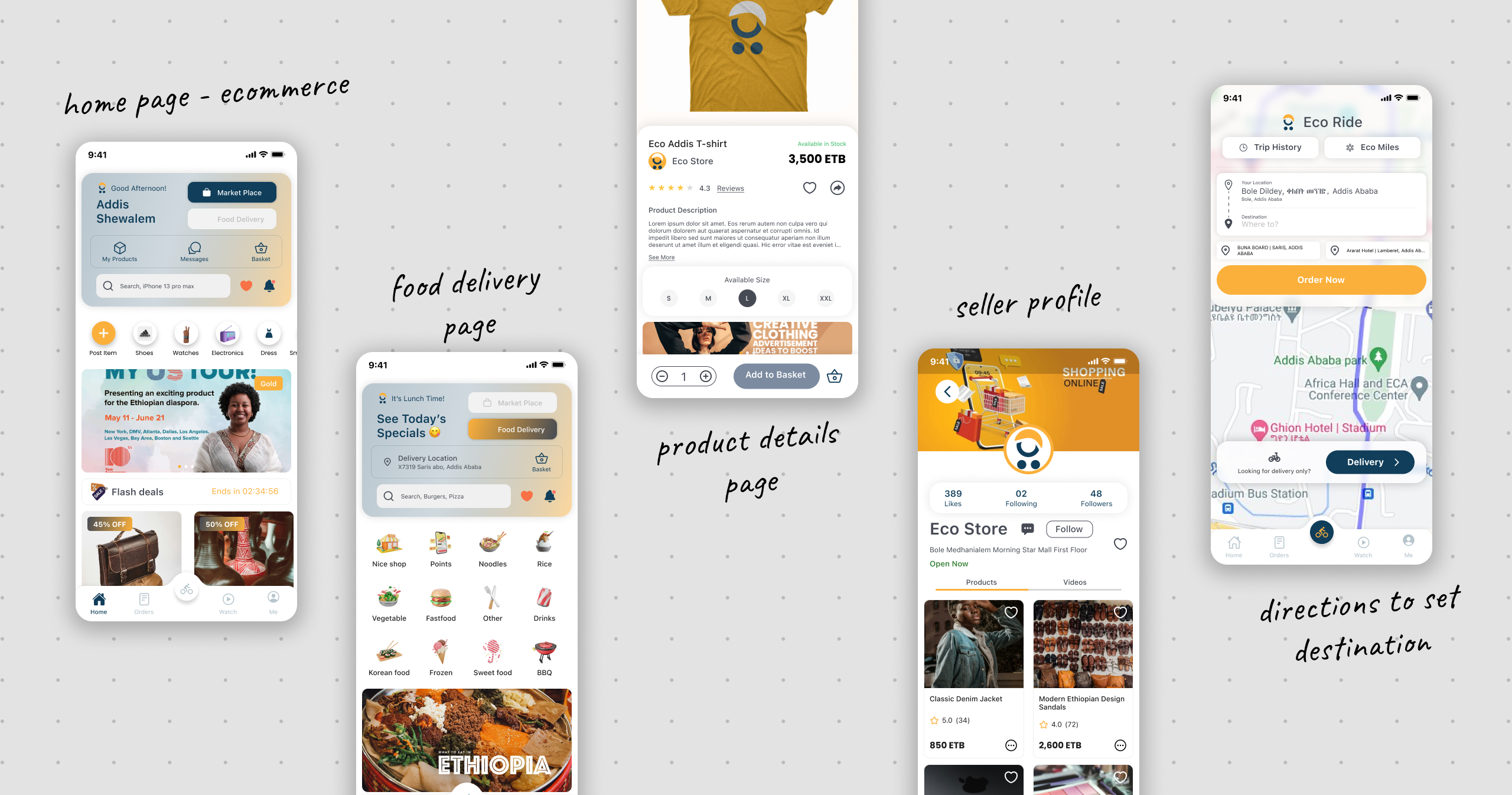
Final Solution
→
A clean locally-rooted mobile super-app with five core verticals: Market Place (product discovery, vendor shops, wishlist, reviews, flash deals); Food Delivery (restaurant pages, special offers, basket, checkout, order tracking); Eco Ride (map-based ride ordering, delivery mode, trip history, Eco Miles loyalty); Watch (vertical video feed for business promotion and discovery); and Me (user profile, my products, wallet, shop management, referrals). Design uses amber/golden yellow primary, dark navy secondary, ETB currency throughout, and real Addis Ababa addresses and Amharic map context.

Impact / Results
•
Onboarding completion rate target: >80%|Time to first order target: <3 minutes|Task success rate (find and add item to cart) target: >90%|Vendor registration completion target: >70%|SUS Score target: >80

Lessons Learned
Designing a super-app requires ruthless information architecture — the hardest challenge was keeping five product verticals discoverable without overwhelming the home screen|Localization is a UX feature not an afterthought — real Addis Ababa streets, ETB pricing, and Ethiopian food context in banners built immediate trust|Social commerce is underutilized in African markets — the Watch tab and Stories features were strong discovery and retention mechanisms|Vendors are users too — the vendor registration and boost flows needed as much design care as the consumer-facing shopping experience
© 2026 Nahom Girma. Designed & Hosted with 🦾 on


Live Preview (Coming Soon)
Eco-Addis Mobile — Super App for Addis Ababa
Title
Eco-Addis — A super-app for e-commerce, food delivery and ride-hailing in Addis Ababa
My Role
Lead UX/UI Designer
Team
1 Product Manager, 1 UI Designer, 1 UX Researcher, 2 Developers
Timeline
5 Months
Project Type
Personal / Client
Tools Used
Figma, FigJam, Google Forms, Maze
Problem Statement
Addis Ababa's rapidly growing urban population faces fragmented digital commerce experiences — separate apps for shopping, food delivery, and transportation. Vendors lack affordable digital storefronts, while consumers juggle multiple platforms with inconsistent UX. Eco-Addis was designed to solve this with a single, unified super-app ecosystem tailored specifically to Addis Ababa's urban lifestyle — supporting Ethiopian Birr (ETB), Amharic context, and local business categories.
Users & Pain Points
Who are the users?
Urban Addis Ababa residents aged 18–40 — students, professionals, and small business owners who are mobile-first consumers.
What are their goals?
Shop for products, food, and services in one place|Find nearby restaurants and get food delivered quickly|Order affordable rides without switching apps|Sell products or run a vendor shop digitally|Discover local businesses through video and stories
Pain points
•
No single app serving e-commerce, food delivery, and rides in the Ethiopian market|Existing global apps (Jumia, Uber) lack local language support and local business inventory|Small vendors have no accessible digital storefront|Currency and payment flows are not localized (no ETB, no local delivery logic)|Distrust of complicated onboarding — users drop off before first purchase
•
Disputes over draw fairness — no verifiable random selection
•
No single place to view contribution history, remaining rounds, or upcoming draws
•
Organizers overwhelmed managing payments and member communications manually
•
No formal way to submit a cancellation or special request
No single app serving e-commerce, food delivery, and rides in the Ethiopian market|Existing global apps (Jumia, Uber) lack local language support and local business inventory|Small vendors have no accessible digital storefront|Currency and payment flows are not localized (no ETB, no local delivery logic)|Distrust of complicated onboarding — users drop off before first purchase
"I want to see my payment history and the draw results in one place — not scroll through a WhatsApp group."
Process & Methods
Goals
Understand how Addis Ababa residents currently shop, eat, and travel — and where digital tools fail them
Methods
•
User interviews with Addis residents across income groups|Competitor analysis: Jumia Ethiopia, ride apps, informal WhatsApp commerce|Card sorting to determine navigation structure for a multi-service app|Contextual inquiry at local markets and food spots (Bole, Saris, Merkato)
Key Findings & Insights
Users strongly prefer a single app over switching — super-app model validated|ETB pricing and Amharic map labels are trust signals, not just nice-to-haves|Flash deals and time-limited offers drive impulse purchases in food delivery|Vendors want easy onboarding — category/subcategory industry selection must be simple|Social features (stories, video Watch tab) increase time-in-app and discovery|Ride-hailing users want saved frequent destinations and trip history at a glance
Final Solution
→
A clean locally-rooted mobile super-app with five core verticals: Market Place (product discovery, vendor shops, wishlist, reviews, flash deals); Food Delivery (restaurant pages, special offers, basket, checkout, order tracking); Eco Ride (map-based ride ordering, delivery mode, trip history, Eco Miles loyalty); Watch (vertical video feed for business promotion and discovery); and Me (user profile, my products, wallet, shop management, referrals). Design uses amber/golden yellow primary, dark navy secondary, ETB currency throughout, and real Addis Ababa addresses and Amharic map context.
Impact / Results
•
Onboarding completion rate target: >80%|Time to first order target: <3 minutes|Task success rate (find and add item to cart) target: >90%|Vendor registration completion target: >70%|SUS Score target: >80
Lessons Learned
Designing a super-app requires ruthless information architecture — the hardest challenge was keeping five product verticals discoverable without overwhelming the home screen|Localization is a UX feature not an afterthought — real Addis Ababa streets, ETB pricing, and Ethiopian food context in banners built immediate trust|Social commerce is underutilized in African markets — the Watch tab and Stories features were strong discovery and retention mechanisms|Vendors are users too — the vendor registration and boost flows needed as much design care as the consumer-facing shopping experience
© 2026 Nahom Girma. Designed & Hosted with 🦾 on
Live Preview (Coming Soon)
Frontline — Policy and Research B2B Platform
Title
Frontline — Policy and Research B2B Market Research Platform
My Role
UI/UX Designer
Team
Frontline Design Team
Timeline
2025
Project Type
B2B / Commercial
Tools Used
Figma
Problem Statement
Businesses and decision-makers need reliable, data-driven market intelligence to grow strategically — but existing research platforms feel either too academic, too fragmented, or too expensive without clear value communication. The challenge was to design a professional, trustworthy, and commercially viable platform where companies can discover, purchase, and engage with market research reports, while also positioning Frontline as a premium consulting brand.
Users & Pain Points
Who are the users?
Four user types: Marketing Directors (needing consumer behavior insights for campaign strategy); Business Strategists (seeking market sizing, competitive intelligence, and forecasts); Startups and Founders (validating product-market fit with consumer research); and Enterprise Teams (buying subscription access or ordering custom research).
What are their goals?
Allow decision-makers to quickly find, evaluate, and purchase relevant research reports|Book custom research services for specific business needs|Compare plan options (Pro / Business / Custom) and subscribe for ongoing intelligence|Access a professional trustworthy platform that signals data credibility
Pain points
•
Existing research platforms feel too academic, too fragmented, or too expensive without clear value communication|Difficulty quickly finding and evaluating relevant research reports for specific industries|No clear way to compare self-serve purchase options vs. custom research engagements|Lack of credibility signals and social proof on existing platforms
•
Disputes over draw fairness — no verifiable random selection
•
No single place to view contribution history, remaining rounds, or upcoming draws
•
Organizers overwhelmed managing payments and member communications manually
•
No formal way to submit a cancellation or special request
Existing research platforms feel too academic, too fragmented, or too expensive without clear value communication|Difficulty quickly finding and evaluating relevant research reports for specific industries|No clear way to compare self-serve purchase options vs. custom research engagements|Lack of credibility signals and social proof on existing platforms
"I want to see my payment history and the draw results in one place — not scroll through a WhatsApp group."
Process & Methods
Goals
Position Frontline as a trusted market research agency with a strong digital presence and a self-serve research marketplace|Communicate expertise and credibility through clean data-forward visual design while ensuring a smooth e-commerce purchase flow
Methods
•
Stakeholder interviews with Frontline team on business goals and target users|Competitive analysis of B2B research marketplace platforms|Review of e-commerce UX conventions for B2B contexts|Analysis of trust-building patterns for premium knowledge products
Key Findings & Insights
Decision-makers need credibility signals (stats, testimonials, team profiles, case studies) at every stage of the funnel|A dual revenue model (self-serve research purchases and custom service inquiry) serves both ready-to-buy and exploratory users|Category and sub-category filtering is essential for a research marketplace with diverse inventory|Pricing transparency with original vs. discounted price and Best offer labels guides decision-making|Social proof layering (Stats to Testimonials to Case studies to Review counts to Trust badges) is critical for B2B conversions
Final Solution
→
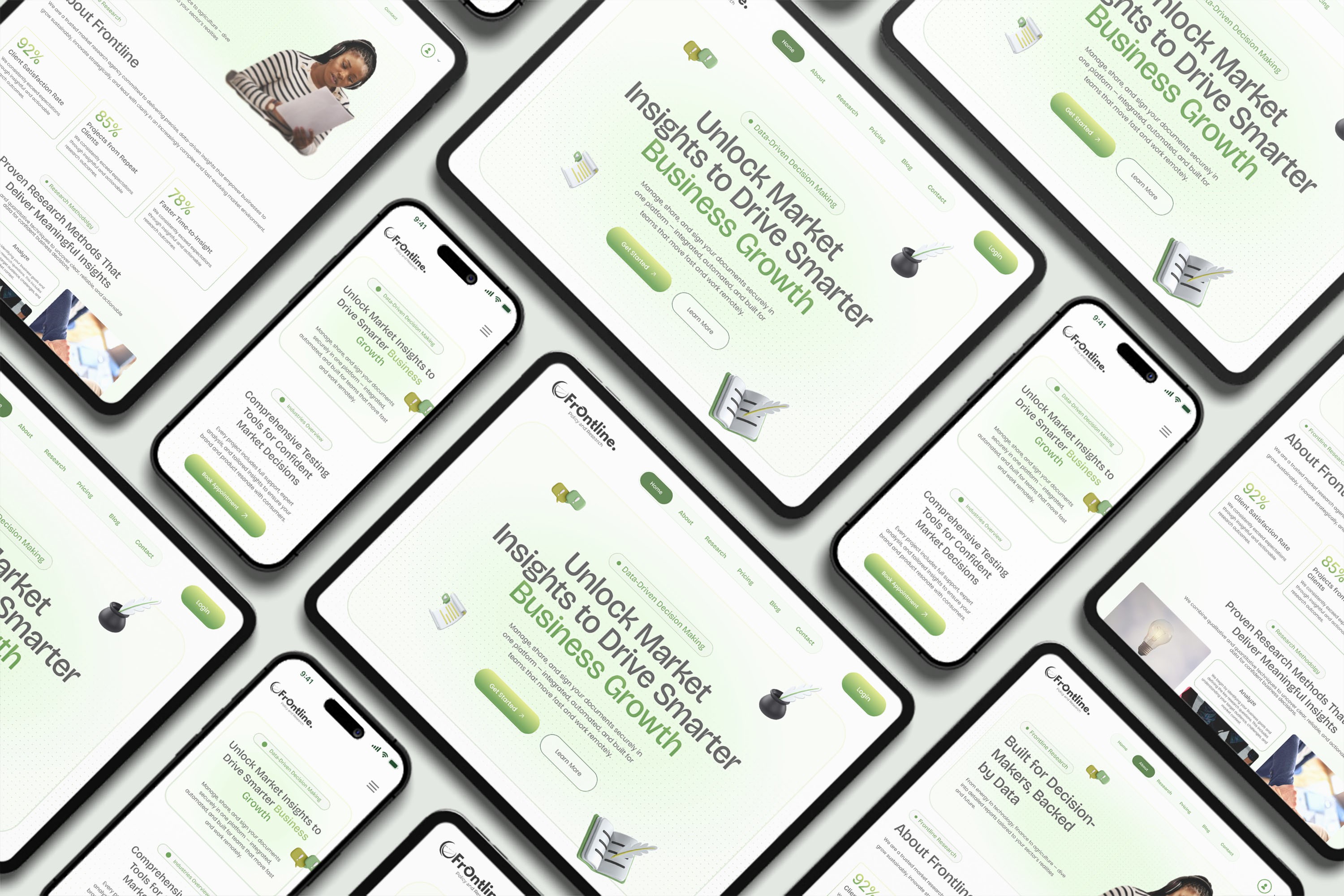
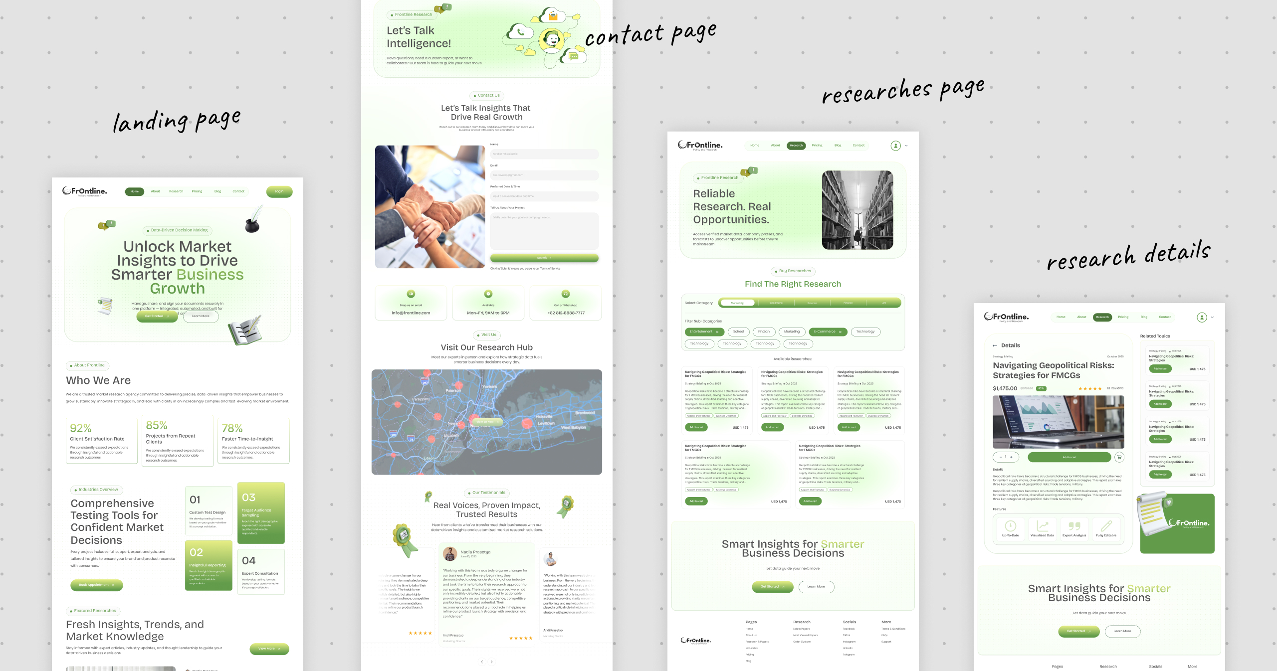
A complete end-to-end B2B research marketplace web platform (10+ screens, desktop-first 1440px) including: a Homepage with bold hero, trust stats (92% Satisfaction / 85% Repeat Clients / 78% Faster Time-to-Insight), services section, blog preview, and testimonials; Research Marketplace with category tabs, sub-category chips, report cards with pricing and ratings, and Add to Cart; Research Details page with full report info and related topics sidebar; Industries page with case study cards; About Us page with methodology and team; Pricing page with Pro/Business/Custom plan comparison; full Cart and Checkout flow (card and bank payment options); and Account and Purchases management.
Impact / Results
•
Complete end-to-end product design from brand landing to research marketplace to checkout to account management|B2B credibility signals built into every page through data, testimonials, case studies, and team profiles|Dual revenue model supported: self-serve research purchases and custom service inquiry|Scalable component system consistent across all 10+ screens
Lessons Learned
The green-forward color palette is distinctive and aligns strongly with themes of growth data and sustainability|Floating 3D decorative elements give hero sections personality without cluttering information hierarchy|Consistent use of the pill/badge pattern for labels and CTAs creates strong visual rhythm|Mobile-responsive design was not in scope for this version — a mobile-first adaptation would be a natural next step|Some body copy in research cards is placeholder — final copy would significantly impact readability and layout density|A dashboard/analytics view for authenticated users could deepen product stickiness
© 2026 Nahom Girma. Designed & Hosted with 🦾 on